
Oculus - Oculus Go.
Visual Design UI / UX / Interactions.
Year: 2017
Role: Lead Visual Designer / Interaction Support for Oculus Mobile "Anytime User Interface" (AUI)
Company: Facebook / Oculus
Tools: Sketch, After Effects, Photoshop, Illustrator, Unity, Maya, Houdini.
Spatial Audit of Former Mobile User Interface
The initial spatial layout of any mobile interface (Gear VR and 3DoF) in the Oculus Ecosystem consisted of a cylinder around the user where a two-dimensional surface was projected. The environment would happen around it either on a three-dimensional way (volumetric geometry) or as an either, Spherical 360-degree projection, or a stereo 360-degree projection (left and right renders to each respective eye.) This introduced very little spatial hierarchy in the native interfaces presented to the user, it was a simple foreground and background metaphor.
This represented a cyclical behavior happening again. Initially, in the early computer days, the way a program would interact with a human was with string inputs, strings were a series of letters that, when written and entered into the computer, would throw a result. If you're old enough to remember the early MS-DOS days (before Windows) you're remember string like "cd..", "cd", "dir", "dir.exe", "disable", "time." Each of these strings was called a command, commands would tell the computer what to do based on the user's input.
As mesmerizing as the initial interactions with computers were, there were many flaws with this same method of interaction, the user had to learn the strings or commands, any misspelling would break a chain of commands and in a way, it was pretty close to programming (write a series of instructions for a desired for the result.)
When Graphical User Interfaces arrived, they represented a harder challenge for programmers. There were many (and I mean) MANY, more variables involved in the interaction of a human and a computer, actions like a drag, close, open, multitasking and many more introduced a higher level of complexity into the architecture and engineering of programs. GUIs, (Abbreviation for Graphical User Interfaces,) made the interaction with computers a LOT more intuitive and understandable for humans but made its programming a new challenge for developers.
Something similar happened in VR. People were very eager to develop in this medium, however spatial software design has many implications that make it a fun but herculean task. That is why in a rush to help developers get into VR and not "miss out" in this opportunity, the VR industry introduced a lot of two-dimensional UI design and developing tools like JS, ReactVR, and others, as a way to help the acceleration of VR as a computing medium. In reality, designing spatial interfaces is a much larger task than to simply design a two-dimensional interface and have it projected onto a cylinder in front of the user.
That was the task that we set up to do in the design of the User Interface of the Oculus Go to use it a small step towards the introduction of spatial hierarchy and for that matter spatial computing.


Initial Sketches
I am very fond of sketching, to my own fault, I can have a good three hour hang out and sketch with another designer to get a lot of ideas. In this case, my partner in crime was none other than the great Chris Nesladek. Chris was the lead on this project and was an amazing collaborator in the making of this project called AUI (short for Anytime User Interface.) We had the same clear rationale in mind; WHY THE HECK ARE WE HAVING FLOATING iPADS IN VR AND CALLING THEM VR INTERFACES?
Chris an I were very fond of using the space in VR to leverage the medium. We had to make it so it was primarily USEFUL, then INTUITIVE and then DELIGHTFUL (Duh! pretty obvious no? just wait for the implementation part.)
With those clear goals in mind, Chris and I gathered around meters of rolls fo paper (which I keep very preciously,) and just drew a lot of ideas, sometimes with an engineer, then a PM will come by and give us input, then back to us two and so on. I personally LOVE these sessions, I feel that they are human collaboration at its finest. There is questioning, arguing and disagreement, but just as there is that, there is also moments of excitement, building up ideas and shaping common thinking into a user flow or a system that feels very solid and engaging. Many of ideas leave the paper, but just like migrating birds from one pole to another, many of these won't make it into implementation and live in a beautiful world of inspiration where they may not serve you directly but go on to live inspiring other designers.


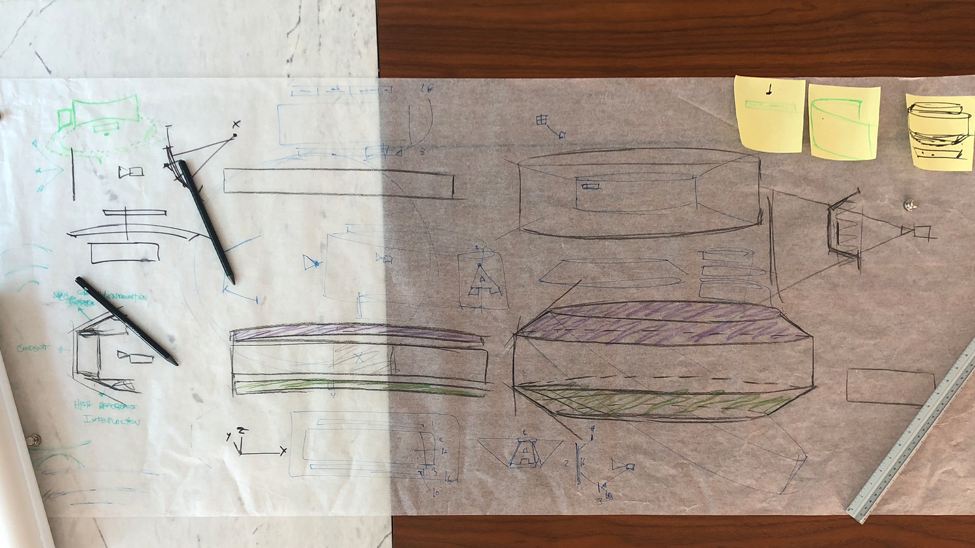
Proposed 3DOF Spatial UI Layout - AUI Dash / Notifications / Content / Experience
Launching was going to happen in 6 months from the time I was briefed in the project to the pencils down and assets and guidelines delivered. We knew we were not going to be able to change much but we pushed as much as we could for spatial hierarchy. We prototyped on the rift very quickly for rapid assessment of space, size of icons, text, layout and more importantly; spatial hierarchy. Architects use this a lot when designing for space and focus on the arrangement in the presentation of elements and the way that implies importance. Spatial hierarchy influences the order in which the human eye perceives what it sees. This hierarchy is created by the spatial layout between forms in a field of perception.
We proposed 3 areas of Spatial hierarchy, UI content, notifications, and AUI (close actionable no longer on a cylinder around the user.)
In a 3DoF VR device, you don't make use positional head tracking. therefore depth perception is almost non-existent by parallax but only through stereo perception. Also, the Oculus go was not going to ship with positional tracking on the controller as well so the ergonomics would not work properly in a natural way. People praised the dash internally but as much as a direct transfer was encouraged by some PM's and other stakeholders. Chris and I knew this would not work due to the 3DoF nature of the system.
The information presented in the Oculus AUI was also not going to be customizable by the user as it was the case with Oculus Dash so a direct transfer would not only not work but would make for confusing areas in the system. So off we went into making sure that this new version that would introduce spatial hierarchy would not only introduce a nice and considered solution but an overall great VR experience.


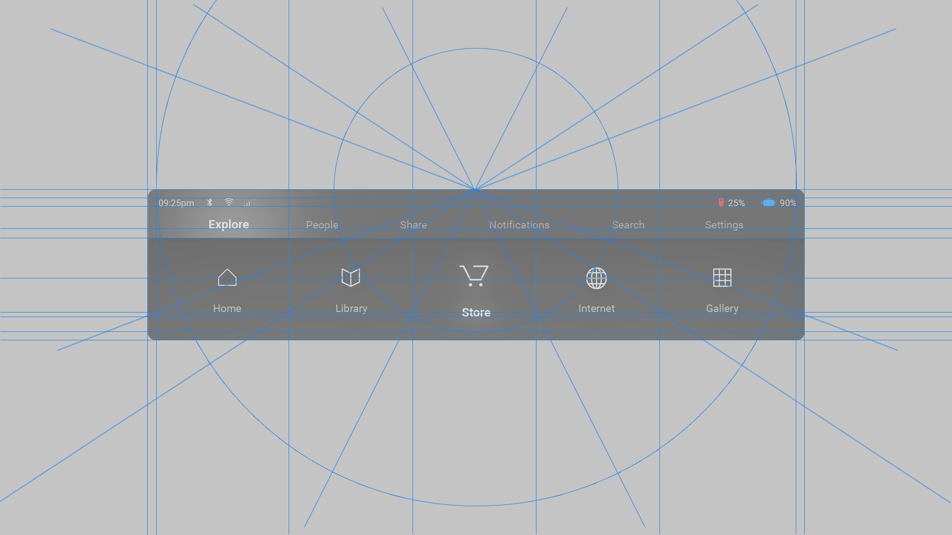
Initial Placement studies based on 3DOF
We put a bit more emphasis on the positioning of the AUI. Since this is was a 3DoF device, the AUI was going to be pretty much head position headlock in space. Engineering shared with us that no three-dimensional objects were going to be implemented for the launch so we thought of a tilted cylinder that could allow for the AUI to be mapped into its geometry. We tested space and distance in Unity and came to a fixed distance that felt pretty comfortable for a lot of the designers that tried it. We did this from our learnings on ergonomics in Oculus Dash. The Anytime UI had to reside within the boundaries of the peripheral and central vision to make sure that it was discoverable and it felt present, while also making sure it felt light and not intrusive. This was something we kept in mind and brought from out design findings in the development of Oculus Dash.
This initial placement was crucial because accidentally, we also discovered that once an initial close by area of the hierarchy is defined, it is much easier to work on the spatial location for the consecutive elements that fall down the line of hierarchy. Once we had our close actionable area defined, the distance for notifications was very obvious and then this same thing happened for the main UI content as well. On our day to day, the brain is usually bombarded with a lot of useless information, throughout the years it has become natively accustomed of investing a lot of focus on the areas that need its attention while reserving a very small amount of attention for the peripheral vision. The peripheral vision was a great way for the AUI to give the user hints of information through a small animation, a blinking light, or badge.

Visual Audit of Former Mobile User Interface
The older User interface used in Gear VR was (by design) very Android-like since Gear-VR ran on the Android Operating System, and it lacked a lot of use of space. As I explained in earlier paragraphs, before the AUI for the Oculus GO the GUI was mapped into a cylinder and everything pretty much happened in this cylinder around the user, nothing moved close to the user, nothing further away from the user. Also, there was this fixation in the industry to make everything in VR "Pixel Perfect." With as much of good intention that exists is in the pursuit fo pixel perfection for Icons and text in Two-Dimensional applications. One has to understand this perfection occurs in two-dimensional screens due to the fact that the screen is the final holder of the rendered element. If an icon is rendered in front of you in the screen and it occupies a kernel of 48 by 48 pixels, the icon will remain with that resolution despite how close or far you hold your screen in relation to you. In that case, pixel perfection is a justifiable practice for the sake of clearer readability and crispier icons.
In VR however, you are looking at the environment rendered in front of you through a grid of predetermined pixels. This situation changes pixel perfection due to the fact that, for example, if you have an icon that, at 1 meter from you occupies 48 by 48 pixels under the "pixel perfect" practices, then this same icon would fall immediately out fo the “pixel perfect” zone the moment it animates in Z depth, or tilts, or rotates. The only way to make icons and text in VR was if the NEVER moved from their assigned "pixel perfect" position or if they were locked to your head in a 6DoF environment. Pixel perfection is something that I wasn't personally very fond of. In the pursuit of spatial hierarchy, quality experiences, and the incorporation of motion design and material qualities, one had to understand that pixel perfection was something that we needed to depart from. Plus, ongoing technological advancements like higher resolution displays in VR or AR will ultimately make physical distance the final accessibility, just like in the real world.


Initial Visual Explorations
When it comes to initial explorations, I am ALL about having fun, of course being mindful fo the deadline and many other factors that one should take into consideration. Opposite to Oculus Dash, we had the advantage of the fact that the information displayed in the Anytime UI was predetermined and not customizable by the user. These presets of information allowed me to look at the overall set of information and arrange it and display it in a beautiful and elegant way. Keeping in mind the very obvious goals of Functionality, Lightness, and Visual Aesthetics I started exploring many ways in which to display and re-arrange the information. I increased the space between icons and added visually light separators this gave the user a visual rest and it made the information feel WAY less cluttered. I also increased the icon's size in relation to its hitbox as a visual technique to also make it feel lighter in the layout. One interesting finding as well, was the fact that, in your peripheral vision objects tend to be perceived as less intrusive if they are larger in size, horizontally more than vertically, opposite to objects that were taller than they were wider, which were considered more prominent.
We also initially played with strips to separate the information for the user but ended up with a more cleaner look where we let space and visual layout drive the hierarchy of information. Little by little the Anytime UI was taking shape. Now you may ask why we didn't go on the ergonomic route in this? One explanation is that the device had only one controller with no positional tracking, to make it ergonomic would have made it confusing beacuse the device nor the controller would know the position of your hand or guess the position of your arm from the positional tracking of your hand. The second explanation is that the Anytime UI had not scrolling mechanism, all the information was displayed in "tabs" the showed the categories, with no scrolling mechanism there was no need to take in consideration the angles of your hands or the rotation of your wrists (pronation and supination.) The third factor was that the number of icons in each of the categories was not so extensive that it needed to expand in an arch. One of the findings we learned from Oculus Dash was that smaller items do not need to curve ergonomically to be more accessible.


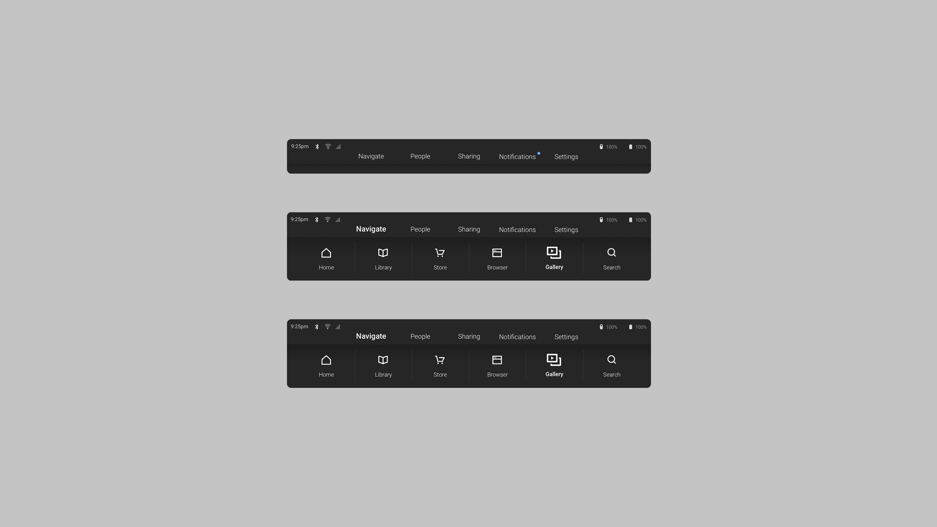
refinement and polishing of Visual design
After some fun exploration, we narrowed down the look for the AUI. The categories like Explore, People, Share, Notifications, Search and Settings will be in the top, divided by a different shade of grey than the one in the overall body. We also moved the battery and time and other indicators all the way to the top of the AUI, we did this because I wanted to make sure that the changes in the color of the indicators from a regular grey to yellow (warning state,) to red (alert state,) would be able to be picked subtly by the peripheral vision. At the bottom of the AUI, you will have the different subcategories with the information there laid out to work within the AUI strip. We felt this would avoid too much of a deep dive to access certain features that would need a quick access (i.e. Volume, Brightness, and Notifications) and eliminate extra interactions while still maintaining the form factor that made the AUI feel really light.
Volume, Brightness, and Notifications would also live inside the AUI and their design was optimized to live within the subcategory space. We didn't want to create another submenu (Settings > Volume > Volume Controls) because we wanted to take advantage of the form and stay true to our finding of objects being perceived as less intrusive if they were wider than they were taller. You will see examples of this during the part of the read in the design of the whole visual system and notifications of the AUI. We also wanted to make sure that, despite the high number of categories and subcategories, the AUI could feel very light and not overwhelming (Something we learned un UR sessions from the belt.) A Small contraction method was also explored but was disregarded due to the lack of service, given that the AUI position in the peripheral vision made it already light without the need to decrease in height.


Anytime User Interface Visual System
After the work on the main AUI, the next task was to populate and create the whole visual language. There were different aspects to take care of one the main form factor and layout were somewhat locked. Icon Badges, Notifications, Volume, and Brightness controls, Accept and Reject Tune In's or Calls, Casting to devices, etc. All these had to be carefully crafted and prototyped before handling to engineering. We had to look at them in VR to test for crucial aspects like size, readability, legibility (text.) Sometimes we would go into a couple of iterations and some design reviews with the primary stakeholders to evaluate the different aspects of the UI. Design reviews were very productive and also, everybody had a clear goal in mind of creating a great product. I guess in a way we knew this product would touch a lot of people who wanted to experience VR, and we wanted to be respectful and thankful for choosing us.
After all these tasks were done, then came the task to export these to engineering following the appointed specs. Testing in the Oculus Go was a bit challenging and we had to account for the resolution and imperfections in the optics of the prototypes. There were revisions along the process of implementation as well and because of the nature of the deadline, design improvements were always in motion. One of the nicest things I got to experience in this product was the eagerness of the Engineers to create something great. They were very welcoming of improvements and details in the design as well as the motion graphics, being faithful to the animation curves and paying a great deal of attention to detail. I have always loved working with engineers as I have mentioned many times but in this case, the camaraderies and sense of support were more than palpable.


Anytime System Notifications
Something really interesting we did on notifications was to make their shape and size relative to the amount of information displayed. notifications could come from different sources, like the system, a game, another user, or multiple users. Since the notifications lived briefly in the lower edge of the user's peripheral vision, on a separate plane than the AUI plane, and the UI content cylinder, notifications would need to change its size and shape according to their content. We gave the notification limits of size (smallest and biggest) of course, and this gave us the confidence to make sure that notifications were not turned off by annoyance but something that was informative and respectful fo the user's experience. This was something very important due to the fact that we didn't want notifications to be a burden in the user and be turned off like in most operating systems.
We also designed noticeable changes that would be easy to discern from the edges of your peripheral vision. Nested notifications would have two circles with the user profiles above the main rectangular notification content in contrast to the single user or system notification. Another example of low intrusion was on the appearance of actionable items like "accept" or "dismiss" only when the gaze of your head was pointing to the message. Only then did we make the items appear in front of you. The flow for the notifications was meant to inform the user, and not to gain any action or a metric for usability. The user will see the notification on the edge of the peripheral view, if the user didn't do anything, the notification would disappear, and if the user looked at the notification then the actionable items will display to let the user do something once the information was granted into the user's paracentral vision.

New Spatial Layout
The new spatial layout was praised internally (and by the media at launch.) It didn't feel cluttered and even though it limited itself to only 3 planes we felt it was a very strong step towards bringing spatial hierarchy and the usage of space in a VR interface. The legibility of text was great thanks to the technology and advancements on shading and rendering techniques for the display of text and many other elements of our user interface. John Carmack was a great collaborator and a stellar guide in informing us about the advances that he and his team were making in these areas. Also, small motion design details were doing their entry into our otherwise very snappy navigation in comparison to other Oculus's Mobile predecessors in terms of UI as a result of no motion integration in the past.
This also felt very natural to people. Objects in our world are arranged by us with a certain implementation of spatial hierarchy. In vehicles, the spatial hierarchy is very pronounced, if an object is far away, it might not be designed to be accessed by the intended user (pilot, co-pilot, back passengers.) This small step in the implementation of spatial hierarchy made the team very happy as we felt it represented a small dent in the development of VR interfaces in the way we thought they should work. Of course like in the development cycle of any product there are countless compromises and middle points where design meets with engineering in the middle AND, also playing devil's advocate, cases where the technology is there, and design still needs to formulate a great use case for given technology.


Motion Tests and Behavior


Paused VR Experience


Shut Down Experience
I always thought that VR was something close to a modern-day theater. Just like in a theater, and unlike a movie, the spectator is able to have a deeper sense of presence by physically being in the same room with the other actors, to be able to hear their voices (spatial sound) and see them with natural stereo input. The way we feel on theatre is in a way, the way we feel in VR.
So when the opportunity came to design the shutdown sequence of the device, I did not hesitate in making it as close as I could to a "lights out, show's over" kind of a metaphor. I changed the layout for the information to not live inside a box (like all the other notifications in the system) and made it feel as surreal and theatrical as I was able to do.

