
Nate Mitchell, Head of Rift presenting the Oculus Virtual Desktop at OC4 (Oct 2017)
Oculus - Dash Virtual Desktop.
Visual UI / UX / Interactions.
Year: 2017
Role: Lead Visual and Interaction Designer for Dash Belt and Virtual Desktop
Company: Facebook / Oculus
Tools: Sketch, After Effects, Photoshop, Illustrator, Unity, Maya, Houdini.
Ergonomic Studies
The ergonomic studies helped to understand not only the range of motion, comfortability, and natural postures for our fellow humans, but also the importance of the different levels of accessibility in space. This understanding allowed us to make critical decisions for each of the different interaction methods, and the displayed information in the Oculus Virtual Desktop experience. After all, the field of ergonomics deals with the efficiency of humans in their working environment, and how humans can use tools more naturally when their design considers the human form. We thought about the Oculus Virtual Desktop as a tool for spatial computing in the same way a computer is a tool for computing. A traditional working desk space has many nuances that have evolved throughout the years. We needed to learn from these nuances and import the ones that made the most sense in VR. The positioning of the belt and its relation to content was essential because it had to be present but not be intrusive in the same way a keyboard behaves.
A keyboard is an excellent example of a device with minimal intrusive rating into the traditional computing experience, once you remember where the keys are, you almost only defer to the screen of your PC. Opposite to a touch screen, a physical keyboard remains in its physical space, and you don't bring it up to your monitor or your field of view to access it. We also had to think of the natural positioning of your wrists and its rotation pivots, the ergonomics of the head when looking down to locate the Belt and the ergonomics of the eyes for your acknowledgment of certain queues in your peripheral vision (capable of understanding basic shapes and colors, but not a lot of detail). In the case of spatial computing, the computing experience could happen anywhere in space, therefore, pushing our design to be less intrusive visually and more comfortable and natural to access.
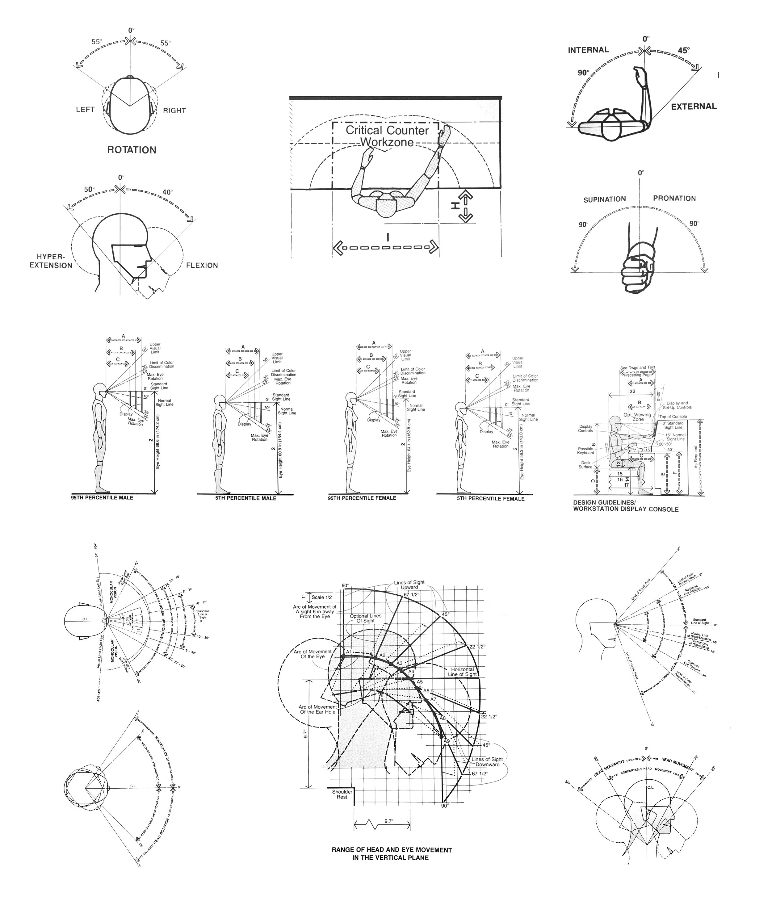
Relevant image captures of the book "Human Dimension and Interior Space" by Julius Panero and Martin Zelnik.
Initial Sketches
I am very fond of sketching and drafting. It makes for a very efficient way to record an idea. Also, other designers get a much clearer idea of your proposal when there is a visual reference as a starting point, making it easier to engage in wonderful conversations. This sketchbook kept accumulating drawings and ideas, as the project started taking shape. This sketchbook occupies a very fond place in my heart since a lot of wonderful conversations with incredibly smart people happened around it (VP, Design Directors, Designers, Engineers, Project Managers.)
These conversations all very much followed a fantastic premise that, disguised as a question, made me fall in love with the Design process. "What if?" What if the controller behaved this way? Or What if we could do this? What if the user could experience this instead of what we currently have? The sketchbook might as well be called the big book of "What if's." After all, Design is none other than sketching and making only to then repeat all over for the "allowed" number of times.

Sketches on paper Semikolon Classic Letter/A4 Size Bound Linen.
Placement and ACCESSIBILITY Explorations
Spatial placement (or layout) was an enjoyable exercise that was always audited in VR and with the input of multiple other designers. Much care was put into the distance of the UI elements in relation to the user and their hierarchical interpretation based on their spatial location. We used an Initial three-dimensional layout that landed us on three levels of spatial hierarchy; Close actionable, Notifications and Content (Environment was not considered as one of those three elements since it could be anything and BE anywhere.) During this process, many key spatial decisions were addressed. These decisions and learnings were born out of questions like; How far should the window be from the user? Or What is the readability of text based on the resolution of our screens? What is the smallest window size? How close does the window need to be to cause optical convergence? At what point does UI become uncomfortably intrusive?
We had to deal with a lot of technical challenges in order to make the VR computing experience a pleasant one. We did this while leveraging against stronger and more evolved experiences like screen-based and touch-based computing interactions. These widely adopted ways of computing had multiple strengths like high-resolution displays, the familiarity of the user with their interactions (touch, mouse, digital pen) and other factors of similar nature. One decision made through this process was to make a lot of the VR interaction elements curved so they felt more naturally accessible and catered the information to the user. We learned this from our studies in ergonomics. Big clusters of information or big panels were curved while small information sources remained flat. This practice informed our decision to make the panels curved when big, and animated to non-curved when they turned smaller.

One of the finalists in our spatial and placement studies. In this image, non-curved UI, with no separation of the information (Continuous Belt.)

One of the finalists in our spatial and placement studies. In this image, Curved UI, with no separation of the information (Continuous Belt.)

One of the finalists in our spatial and placement studies. In this image, non-curved UI, with separation of the information (Non-continuous Belt.)

One of the finalists in our spatial and placement studies. In this image, Curved UI, with separation of the information (Non-continuous Belt.)
Initial Visual Explorations and Interactions
Just as significant as the Belt shape and its placement overall, (going back to the metaphor of the keyboard) was the interaction with the information displayed by the Belt. Once we had an idea of the frame in which the user events would happen, it was essential to understand the feedback that was going to be granted to the user while these actions occurred at any given point. During this fantastic process, MANY questions and their accompanying hypothesis were formulated. Will they be buttons? And if they are buttons. Will there be a hover-over state? Or No hover-over state just like in real life? What is the interaction method? When pushing, do we use the natural behavior of a button which is to sync when pressed? Or do we use actually raise them to give them visual priority? How do you do Multitasking? How do you pause an Experience? How do you sort through apps?
As a designer, this orgy of inquiries is a dream AND a nightmare, all at the same time, especially when having the enormous privilege of being able to enable other humans with a new way of computing. Visually, the same principles were translated into pretty much anything we would explore, low Intrusion, easy understanding and naturality of the required human motion in the interaction. Many questions raised through the process; How do these access points (buttons) present themselves in the world? And where do they live in the world? Where do they appear? How many do we display at once? Is this the best way to display them? How big are they? How do they exit? Where do they go?

Initial exploration for app switching which proved visually appealing in its 2D form while not so successful in VR.

Motion study against content.

Motion study against a solid background.

Rapid prototyping for button behaviors.

Explorations in "glass chips" concept for multitasking, button states, button labels, and visual feedback for hover-over.

Carrousel behavior for scrolling apps. (close up)

Carrousel behavior for scrolling apps. (wide)

Rapid prototyping for a curved cluster of buttons.
Prototyping of Interactions
Prototyping of interactions is, as much as being able to look at things in VR, a KEY step into the bulletproofing of any design idea. Numerous times, the initial visuals are great, the motion describing their behavior is flawless but at the moment of the interaction, the idea could just prove not be successful for multiple crucial reasons; too hard to interact with, muscle strain, hard discoverability, confusion from the user, interrupting, accidentally hitting or activating other objects or processes. These were all invaluable exercises that made us think truly hard throughout the process of making any UI element non-intrusive and visually pleasing. We also discovered that, as stated in one of the principles from one of my favorite all time designers, Dieter Rams; "To make design invisible when not needed" did not only imply something as mere as adjusting the transparency of the item (Something incredibly easy to do in Computer Graphics,) but to make it so the element was essential for the design problem that it solved, therefore making the user adopt it as an extension of himself or herself. The form of the belt was accepted and praised internally however now we had the problem of the interaction with it, which also involved iterations over the visuals. How big are the buttons? How do they animate? What is their active state? How is the user informed of these states?
These prototypes also made us appreciate the value for natural feedback in many analog items. The soft damp on a knob, the snap of a switch, the small clicks of a volume turning wheel, the changes of friction in different kinds of surfaces, stickiness, all these ways of reflecting feedback to the user would have been amazing to have in VR. (I am sure future generations and the ongoing advancement of haptic technologies will allow for future explorations in the subject.) At the time we had to work with the Oculus touch controllers (Amazing VR controllers,) which allowed us to prototype ways to inform the user other than visual. The final prototypes permitted for a small and effortless wrist turn for scrolling through the content of the Belt that kept and absorbed the momentum of the user motion and used its velocity towards an amplification of the force applied in the gesture (Inspired by Bas Ording.) We also used a lot of the inputs in the controller (Joystick) for quick access in case the user was not able to make the scrolling gesture. We accompanied the visuals with haptic feedback as well for when the scrolling had reached its limit (Bas Ording as well.)

Prototype for infinite apps chips scroll. (Scroll and tap on app.)

Belt Scroll with grip behavior and color feedback on button.

Prototype for infinite apps chips scroll. Scroll on both sides.)

Belt Scroll with swipe behavior and white light feedback on button.
Belt Information Design, Command center & Notifications
The arrangement and display of the information of the Belt went through several iterations. One of the tasks was for the user to identify VR experiences vs. desktop apps very easily. We did that through the design of three different types of buttons (more info on Engineering Guidelines section.) System Icons, Desktop Apps, and VR Experiences. As you will be able to observe in the iterations, we thoroughly went through different stages even to the extent to make the belt shape very complex by adding everything from tabs, more buttons, and extra information. (Date and Time, Year, Volume, Battery Life, etc.) All these iterations, as painful as they were, allowed us to distill learnings and create a strong point of view in favor of simplicity. When shown in User Research the users would react very overwhelmed by the complexity of the "Show it all" version, while on the other side there was a much nicer response from the users when the belt was shown in it more simple form. They felt the Belt friendlier, more accessible and they were more open to discover its functions.
The Belt also needed a way to have a built-in way to access information like Date and Time, Year, Volume Battery life, etc. It also required a way to access notifications from your friends and your installed VR experiences and Apps. We iterated and used the wings of the belt, just like in a real-life desktop, the user will arrange the most important information, displaying devices in the main field of view while keeping secondary information devices accessible. The beauty of the peripheral field of view, and the way it gives us information, is that it is designed to let you know about small pattern changes in your visual feedback. Small changes like an activating light or a jumping button or icon will be recognizable while not breaking from the viewing experience. Also because of the ergonomics in the construction of the Belt, access to the two side wings (left and right) was an effortless head turn and a hover away for the user to quickly acces the information and deciding to act upon it.

Initial iteration with command center on the right wing. The place of command center was switchable for left and right accessibility.

Iteration with left toggle switch to show “complex mode“ vs “simple mode.”

“Complex mode“ showing the user a lot of controls.

Iteration of the right wing showing notifications and the left showing command center. Both panels would be hidden until the user hovered over the wings. Command center (left) shows a button version.

Iteration of the left wing showing notifications and the right showing command center. Both panels would be hidden until the user hovered over the wings. Command center (left) shows a list version version.

Iteration of the leftt wing showing notifications and the right showing command center. Both panels would be hidden until the user hovered over the wings. Command center (left) shows a list version version and higher number of battery level indicators.

Iteration of the leftt wing showing notifications and the right showing command center. Both panels would be hidden until the user hovered over the wings. In this iteration the notifications became actionable items. (Text description version.)

Iteration of the left wing showing notifications and the right showing command center. Both panels would be hidden until the user hovered over the wings. In this iteration the notifications became actionable items. (Color description version.)

Different variations of the notifications panel with actionable items and its states.
Spatial reference for the placement of the wing panels. (Ergonomic version shown.)

Final design for 2017 OC4 release. (Panels hidden.)
Belt Visual DesigN Polish
After the belt had proven to be user-friendly in User Research sessions, some time was granted and used to finesse on areas that we thought were important for the experience. We knew we wanted a soft light that will not only serve as a scrolling indicator but also as a nice aesthetic touch to the shape of the belt. The materials were also worked to resemble a matte material close to high-end matte plastic or aluminum. We wanted the scrolling-end indicator to light up as well (accompanied with haptics) to notify the end of the scroll but also to serve, just like in the scrolling indicator, as a considered aesthetic element that would complement the Belt.
We also put a lot of time in the three-dimensional construction of the Belt (edges, curves, creases, and corners). We wanted to make sure that it reacted nicely to the different VR environments in which it was going to be displayed. Multiple studies in different environments and lighting scenarios were tested. We wanted to make sure that the behavior of the buttons was crafted, in the same way the buttons of the keyboard in a laptop are not only part of computing experience, but also part of the design of the laptop itself. We worked with PBR shaders and created a Polar HDRI light probe to serve as the default light state of the Belt.

Final design for the Belt with buttons for System Icons, Experiences, and Desktop Apps.

Form reaction to lighting.

Form reaction to lighting.

Scrolling indicator.

End-scroll indicator.

Button case indicator.

Button behavior.
Belt Motion Design and polished behavior
During the polishing phase of motion design, a lot of details were adjusted. The speed of the scroll based on the input of the user. The hover and press state of the buttons as well as their respective distances and animations. App labels were added as with a subtle fade animation for their intro and out states. The intensity and timing of the lights for scrolling at beginning and the end of the scrolling behavior. All these small details were worked with the goal of making any complementary design on the belt very subtle and unforced.
All of these polished areas were later on tasted in VR. Motion design in 2D works as a good way for you to start a conversation or to gauge the feeling for your idea when shown to the rest of the team, however, it is always crucial to look at your design in place in VR (or AR, if that's the case) to truly get a sense of the design in its purposed and final medium. Many of the polished areas as well we discarded as we felt they added visual noise to the interaction experience.

Belt intro animation.

Belt scrolling interaction and animation.

Belt hover and tap behavior. (With app labels.)

Belt hover and tap behavior with app labels. (Close up.)
Belt Engineering Guidelines
The engineering guidelines were meticulously crafted to communicate engineering of every single detail in the construction of the belt and other elements of the Oculus Virtual Desktop. These guidelines showed many aspects of the belt and its components. In the case of materials, shader properties were translated into their PBR description only to follow a visual audit that made sure the Belt final look could visually match the crafting that went into the prototype. Buttons were also described in detail, from their proportions all the way to their construction elements and all of their many layers. All of the animations were exported as bezier curves along with their duration in seconds (time unit) to be fps agnostic.
The guidelines were not only useful for the engineers but also very useful for the design team and the rest of the organization. These guidelines also proved to be very inspiring for engineers and, given that not a lot of the features were implemented in our first release, by having the guidelines as a roadmap of an aspirational product goal, a lot of the engineers were eager to implement them later and, as result of that, you can see them now in the current release. There is a magic working with engineering that I have always been very fond of. I feel that the mix of artistry and technology always brings amazing discoveries even during the process of implementation.

Belt body, materials and elements guideline.

Belt buttons construction and interaction guideline.

Belt button states, construction, proportions and animation guidelines.
Virtual Desktop Layout and Visual Design
Having multiple windows was not only a given feature but also, it felt very natural to leverage the medium (VR) to give the user many windows to place multiple applications. The physical experience in traditional computing is bounded by the number of monitors at your disposition and multitasking is possible by either minimizing one of the applications or sharing the screen real state between applications (which diminishes the viewable area of the app sharing screen space at the same time.) VR offered a perfect opportunity to take advantage of the digital world. You simply open an application and since spatial computing happens all around you were able to have many windows open (just like screens) with the pay off of having to access the ergonomics of the neck or a hip rotation while refraining to working on a 180-degree working area (larger work areas user more effort and other ergonomics. Surprised! just like the real world.) Giving a sense of order to the user while still allowing flexibility was a fun problem to approach
Visually there were a lot of questions and learnings along the way. Do we give the user the freedom to move and rotate the windows? Do we give them tilt controls? How do we deal with resolution constraints and legibility of text? We came across the idea of introducing the user to an invisible grid, only visible when trying to place the window panels in space. We ran may iterations to find optimal sizes for the main window in front of the user's main viewable area. The side complementary window panels were just as important and we ran iterations in the arrangement of these panels. We decided to give the user the guidance to arrange the windows not only as the wished but also allowed for tilting and different facing-user positions. We realized that in traditional computing, monitors arms that allow the user more flexibility are preferred over the ones that are restraining and have a defined behavior. We also added features like scale window and position window in Z space as well.

Initial iteration with a small number of window panels.(glass Belt shown.)

Initial iteration with a high number of window panels. (glass Belt shown.)

Initial iteration with a high number of window panels. (OC4 Belt design.)
Dash Window Chrome Visual Design
A lot of the UI around traditional PC computing application windows (MS Windows, OSX) in their native operating systems are optimized of the interaction method in which they will live. A very familiar example is the chrome UI for windows in OSX, the window UI for windows in OSX exposes the familiar; close, minimize and full screen that we are all familiar with. On the other hand, for their touch devices, like the iPhone and the iPad (iOS) they use a different interaction method, optimized for the environment in which they will live (close, minimize and full screen are gone). We faced the same problem in VR, a lot of the interactions with the windows needed different and new functions that required (since we didn't own the OS, Windows, in this case) to display a new set of capabilities in the chrome of the Windows Apps.
Close, Minimize to Belt, Pause, Resize and Orient needed to be accessible as an extra layer of Chrome on top of the Windows. These were very important features in the Oculus Virtual Desktop experience. Another important reason for exposing another layer of chrome UI (our custom VR Window Chrome) on PC apps as they were used in VR, was that the native functionalities that Windows (the OS) offered in their native windows (close, minimize and full screen) were either not easy to access while working in VR and or they were not consistent with or break the Virtual Desktop experience. Functionalities like Maximize would not make sense in VR and Minimize would send the app minimized to the Windows (OS) taskbar which would make it hard to access while on VR.

Initial minimal iteration with color spill of the window panel into the material of the chrome.

Window panel chrome iteration with lower right controls and contextual three dot menu expansion. From left to right, contracted chrome, expanded chrome and contextual menu states.

Window panel chrome iteration with lower center controls and contextual three dot menu expansion. From left to right, contracted chrome, expanded chrome and contextual menu states.
Interaction Explorations
Working on a Virtual Reality Desktop experience brings a lot of new findings that are a treasure for those of us who have been part of the transitions between personal Home PC's to laptops, to mobile. While we rescue a lot of natural human interactions (pull, push, touch, grab,) many other interactions from the real world do not make sense in VR and they need to be replaced for new ones. Pulling windows out of other windows, having portable contextual menus, hovering magnification glasses and floating notifications are only a few of the many interactions we were able to explore that truly leverage the VR medium to create pleasant and intuitive virtual experiences. Many of the explorations you see here had in mind to spark the curiosity or inspiration of fellow designers and engineers to try to prototype some of these or to simply look at them in VR for further evaluation and later consideration.
We would always try to even play devil's advocate and question if some of these interactions made sense and were deserving to exist in VR. There are many challenges in the current state of VR like limited resolution, limited field of view, no varifocal screens among many others, so it becomes crucial to design a considered experience around the current state of technology as well as making assumptions towards what aspects of the technology will change so the design could be scalable or inheritable. VR interactions are an ongoing quest for many of the companies working on this problem. Many changes in controller manufacturers, different devices hand recognition sensors and other implementation will make VR interactions more coherent in the future.

Tangible window behavior (Inspired by Bas Ording)

Magnifier to deal with limited resolution VR displays.

Command center interactions. (Trigger buttons, state buttons and volume slider shown)
Accompanying notifications window. (Appearing and disappearing animation.)

Wrist base command center.

Multi-window management interaction. (Panel and list versions shown.)

Window on main OS system (curved panel) to extracted mode (non-curved,) to detached mode (curved again.)

Pick a window to remain accompanying you in VR (pin to experience,) even while Virtual desktop is not active.

Notifications interactions. (Reply and dismiss indicators on right and leftt sides of the notification.)

“Where is my VR panel” bottom fetching light indicator.
Motion and Visual Explorations
A lot of visual explorations were done for visuals, all the way from animation to materials. I was lucky enough to have a great team of colleagues that allowed me to explore these initiatives and make them look the best I could. As I posted above, having these explorations at hand becomes very useful to have conversations around them. Some ideas will die, some will become aspirations, some will be implemented in the next cycle. It is always important to always be respectful of ideas during the design process. The idea will have many sources but it is important to always keep feeding this vault of ideas an explorations in a design organization.
One thing we kept in mind while designing for Dash, was to always try to leverage the medium and therefore always asking the question; Is this experience, SUBSTANTIALLY better in VR? We kept in mind features that are native to VR like stereo vision, depth perception, stereo specularity and try to use those in our advantage. three-dimensional portal effects, blob contextual menus, room sound feedback system, different material properties in the different areas of the UI were a few do the explorations that we try to get our ideas across. We used a variety of tools for these explorations, from simple spatial visualizations in Unity, to pre-rendered videos and animations.

System panels animation and “physical material like” properties in sections of the information.

Spatial sound feedback indicator explorations. (Listening mode shown.)

Fractal-inspired material for creating a “digital branded material“.

Fluid contextual menu, the main button looses volume as it feeds its branches (Panel Scale controller, Inspired by Bas Ording)

Portal-like window behavior for content browsing.

Fractal-inspired material for creating a “digital branded material“. (Applied to UI)
Presentation and OC4 Talk
Oculus Dash was presented at OC4 in San Jose, CA and it was received with great acclaim. Developers and VR users felt it was a nice transition for virtual computing. As a team, we could not be more proud of the work done here. There were many areas that we wanted to make better as always, but we put very long hours hard work in this wonderful project.
There was also a talk given about the Oculus Dash showing its capabilities and its many uses in VR. Hearing the applause of the developers and VR enthusiasts made it a magical morning. It was truly a once in a lifetime privilege to be able to work in projects like this, that will enable new forms of computing for other humans down the line.
Final Thoughts
I cannot emphasize enough on the power of experimentation. During any design process. Try new things, explore a new idea and show it to your colleagues. Be open to criticism, put your ego on the side and really make about the common goal of making an amazing experience for the user or your customer. If you have an Idea, is better if you make it into a visual, an animation or a quick prototype, then call a colleague or a friend over and listen to what they have to say, if the idea is good, your colleagues will have add-ons and incredible suggestions to make it better. If your idea is not well defined they will poke holes on it and question it to see how strong it could be, which will only help you strengthen the exploration in future iterations. Remember to never take it personally, if you're calling your colleagues over, be respectful of the time they are investing in you and being close-minded and not open to criticism only sends the message "I just want you to look at it and not tell me anything", which is ultimately disrespectful and creates negativity in the working environment.
Don't fall in love with your exploration, more importantly, fall in love with the common goal of the group and help disseminate the desire to make something great. Use any exploration as a catalyst and be OPEN to the exploration not making it to a final stage but be HAPPY if it sparks a great idea in any of your colleagues. If you're open to criticism, your colleagues will have more respect for you, you'll learn from them and you'll be recognized as a pleasant member of the team. As a product of this practice, you'll also be considered for reviews, comments, critics and more importantly, this ritual would only create a positive environment. After all, we are so lucky to spend countless hours with our fellow designers so it is only rational and most beneficial to make it feel like a family. Remember that design is much better as a collective effort, and the more voices are able to collaborate, the better an idea will form.